Pages

Tuesday, 31 March 2015

Pasta with Purple Sprouting Broccoli - Sicilian style? #TriedItFree

If you read my husband's blog, you will know that he is passionate about growing - and eating - Purple Sprouting Broccoli (henceforth known as PSB). One slight snag with it, though, is that a huge amount tends to be ready all at once, and as we don't eat "meat and two veg" style meals every day, it can start to mount up in the fridge.

However Mark was recently told about a Sicilian dish that somebody had enjoyed, which combined pasta, PSB, sultanas, pine nuts, chilli and cheese. We had no idea what the proportions were, how the ingredients were used, or what the finished dish was supposed to look like, but when I was sent vouchers to try Tesco Finest Pasta through their scheme "The Orchard"  I thought it was a great time to test out the combination of ingredients and see what kind of a dish I could come up with.  I decided to try the Fusilli Lunghi, simply because they look so pretty! And here's what I made.....


Pasta with PSB

serves 2

150g pasta
120g purple sprouting broccoli
25g pine nuts
50g sultanas
 ½ tsp chilli flakes
2 cloves garlic, crushed
40g finely grated parmesan
½ tbs olive oil
10g butter
seasoning

cook the pasta as directed on the pack. Place the PSB in a steamer and cook above the pasta until just cooked – I like to cook it for 4-5 minutes.

While the pasta and PSB are cooking, heat the oil and butter in a small frying pan and toss the garlic, pine nuts, chilli flakes and sultanas in it until the pine nuts are lightly browned,  season and then set aside.

Drain and dish up the pasta, top with the PSB, spoon the pine nut mixture over it and sprinkle with Parmesan.


The result was absolutely delicious and is a dish we'll come back to again and again. Next time, I think I'll try adding a squeeze of lemon juice to the pine nut mixture. Very little effort but a great combination of flavours and textures. And we loved the pasta - it kept its shape well and didn't go to soft or mushy, which meant that it was very satisfying, as well as being the perfect shape for the dish.


Print Friendly and PDF

#TriedItFree

Something beginning with S at Cardz 4 Guyz

It's Tuesday, it's 9 o'clock and it's time for Cardz 4 Guyz new challenge - and this week we want to see "Something beginning with S".

I've chosen S is for...... SHIRT. Some years ago there was a craze for making little origami shirts to use on cards, and a quick internet search showed me that there are still lots of instructions for it available. I followed the one you can find here to make my shirt, using a check paper from the Docrafts Heritage Press range.  The buttons, tie-fabric print background, side panel and sentiment all came from the same range with just a scrap of ribbon to finish it off.


Monday, 30 March 2015

The great, big, enormous TAG

Usually when I make a tag, it's the size of a standard parcel tag or just a little bigger. But this time I wanted it to fill the front of an A5 sized card, so I cut a HUGE one from kraft card.


This is my interpretation of the inspiration photo at the current Tag You're It challenge


As it's all made from snippets, I'm dropping into the Snippets Playground at Pixie's Crafty Workshop again - my second visit to the playground this week - and I'm also sharing with Flowers at Make My Monday.

Sunday, 29 March 2015

Pastel petals

It's been snippet central chez Onions and Paper today! Cutting out all these tiny die cuts means that even the smallest scraps of card in my snippets box have justified their existence.

I cut the four brighter green squares with the die that came free with my old Cuttlebug - I hardly ever use that die and I can't think why. The squares were then embossed with the Swiss Dots folder.  Then I cut and embossed the flowers and leaves in lots of pastel colours.


I'm sharing this with Pixie's Snippets Playground  - week 170
AAA Cards - game 36 - Easter Colours

A Brayer-and-Salt background

This week's challenge at Less is More is to combine  any THREE past challenges. I thought this would be a great opportunity to try some of the challenges that took place before I started to play along, so I looked at the very earliest challenges and chose:

Week 11 - Acetate
Week 12 - Off centre
Week 31 - Metallic

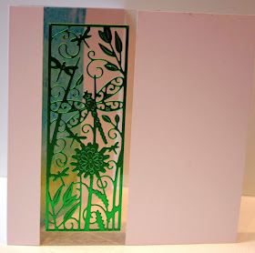
I die cut the Tattered Lace dragonfly panel (this is the cover mounted die from the current issue of their magazine) in a green metallic card, then cut a panel slightly larger than the die cut - off centre of course - in a white card and backed it with acetate, and mounted the die cut on the acetate.


I felt it needed something to show through behind the acetate, so I cut a piece of card slightly wider than the acetate panel. I used normal stamping card, not the glossy card I would normally brayer. It needs to be quite heavy card to prevent buckling when wet.  I brayered it with a Kaleidacolor Caribbean Sea inkpad, then spritzed it thoroughly with water, and immediately sprinkled coarse sea salt over the surface. I left it to dry (well, actually I encouraged it a bit with my heat gun) then used a stiff, clean stencilling brush to sweep away the grains of salt. I was left with a panel that reminds me a lot of the ripples on the surface of a pond  - I mounted this on the back panel of the card to sit under the acetate window.


Saturday, 28 March 2015

Orient Excess

So, I've been having a sort out of old stickers. Many years ago, I bought a collection of Oriental clear peel-off stickers from QVC. I used most of them right away, and ever since then the odd few bits and pieces left on the sheets have looked at me reproachfully every time I open my sticker folder. Admittedly, that is less frequently than is used to be, but nevertheless those almost-empty sheets are taking up valuable space and I really ought to use them up.

I picked out a few sheets, gold and silver butterfly borders and corners, and bamboo borders, and decided to combine them with some stamping. For my first card, I stamped and embossed the butterfly and bamboo image in gold on black card, then stamped it again without embossing, in back on white card. I then cut out the two main butterflied and applied them over their own images on the first piece using 3D glue. I put this onto a white card, edged with gold bamboo and butterfly corners. Half of me wants to throw something else at it - some gems or Chinese coins in the white space either side of the image, the other half of me is sternly reminding me that I've got lots of experience of CAS cards now and am no longer afraid of white space!


For my second card, I stamped the image in black on white then coloured it in very lightly with soft shades of pencil. This I added to a black base card, with silver borders and corners, and on the inside I added a plain white writing panel with the last few stickers from the silver butterfly sheet.


I'm joining in with
Butterfly Challenge - C is for Corners
Use Your Stuff -  #178 Stickers
 
Oh, and why have I called the post "Orient Excess"? Well, partly because I was using my excess stuff, and partly because I only set out to make one card but ended up making two!

If the shoe fits......

I have very mixed feelings about the Viva la Divas CD-ROM from Joanna Sheen. Sometimes I decide to get rid of it, thinking the images on it are so big and inflexible that there's not much you can do with them except plonk them on the front of a card. And then an occasion comes along that one of the pictures on it is perfect for and it earns a reprieve.

This time, I decided to try to do something more than just plonking the image on the card - each sheet contains the main image twice, so why not cut out some of the elements of the second image too? And why not separate the image from the sentiment? By doing it this way, I was able to position the sentiment partway over the image, positioning one of the cut out parts of the image over it so that the lady wasn't obscured.

I think this is the "least uncreative" way I've used this CD, and it has satisfied me that it DOES deserve a place on my shelf rather than on the charity shop pile!


I'm joining in with Ooh La la Creations #176 - She's in Fashion.
and Suzy Bee's challenge - Add a sentiment
and a second visit to the current CD Sundays challenge - Sentiment

Thursday, 26 March 2015

Daisies in the spring

I noticed the first daisies peeping through the grass of my neighbour's lawn this morning - spring really is here at last! And to celebrate, here is a card that celebrates daisies!

I've had the main image stamp for many years, it is an unmounted stamp that came in a grab bag, and I must have used it hundreds of times. I'm not sure the flowers are meant to be anything specific, which is useful as they can become a stylised version of whatever you want them to be, depending on how they are coloured. This time I coloured them in by scribbling watercolour markers on acetate then picking up the ink with a waterbrush, apart from the tiny flowers which I coloured directly with the markers. I'd have really liked to do them in forget-me-not blue, for the full-on spring effect, but I didn't want to introduce another colour. However, pink forget-me-nots are often found in gardens so I've not used *too* much artistic license.

The paper, card, ribbon and pearls are all long-time lurkers in my stash!


I'm sharing this with

Addicted to Stamps and More - Make your Mark
Crafting Musketeers - Ribbons and Pearls
Clear it Out Challenge - Birthday and Polka Dots    
Crafty Gals Corner - Anything Goes
The Crafter's Café - Spring Flowers

Wednesday, 25 March 2015

More green - it must be the time of year!

It's the season for new, fresh greens everywhere.... even in crafting. Today I have combined this week's Make My Monday theme, which is The Colour Green,  and the Addicted To CAS code word of GREEN with this super-versatile sketch which is the current challenge sketch at CAS on Sunday.


I masked off the card to leave a broad stripe, then stamped the fern leaves in Versamark ink, chalkinh over them with several different shades of green chalk. Then it just took a little stamping and die cutting to complete the card.

Bread machine hot cross bun loaf

At this time of year, the smell of hot cross buns (or, I suspect in some cases, hot cross bun scented air fragrance) wafts through every supermarket, and if we are lucky enough to have the time and patience to make hot cross buns, through our homes too.

But what if you are having a busy day at home, yet would love to have the air scented with that hot fruit-and-spice fragrance? Wouldn't it be lovely to be able to reward yourself at the end of the day with a cup of tea and a slice of warm hot cross bun flavoured bread?

Well if you have a bread machine, it couldn't be simpler. All it takes is a few tweaks to your bread machine's standard white loaf recipe - I'll not give a detailed recipe for that, as every machine is different.

Use the recipe that comes with your machine, plus the following ingredients:

1 teaspoon ground cinnamon
1 teaspoon ground mixed spice
about a quarter of a nutmeg, finely grated

1 measuring cup full of dried fruit - you can use dried mixed fruit, or mix your own. As we don't care for mixed peel or cherries, I used a third of a cup each of currants, raisins and sultanas.

Add the spices at the same time as you add the flour, then use the basic loaf setting to make your bread.

To add the fruit, if you are lucky enough to have a model with a fruit and nut dispenser, use that. Or if your machine makes a beep at "adding extra ingredients" time, use that. If it has neither, set a buzzer somewhere to remind you to throw the fruit into the machine after about half an hour of mixing. Then just let the machine do its thing.....


So, it's not bun shaped, it's not got a cross on the top and it isn't glazed. But it tastes and smells just like a hot cross bun, and it makes toast to die for! And if you aren't as addicted to your bread machine as I am, and find it gathers dust in a corner, at last here's something that will make it earn its keep!

For the first time in ages I'm joining in with #CookBlogShare at Supergoldenbakes “#CookBlogShare

A Christmas Card!

At the start of 2015, I decided I was going to make two Christmas cards a week so there wouldn't be a last minute rush this year. However, I've just looked in my Christmas card box and so far this year I have made........ TWO. So if I'm going to catch up, I'm going to need to catch up pretty sharpish. Which means making quick cards. And here is a VERY quick one.


The super-simple layout is CASE'd from Chrissie's DT card at Less is More


I'm also joining in (at last!) with Rudolph Day at ScrappyMo's  and with
Fab'nFunky Challenge #252 - Christmas
Christmas Card Challenges #16 - Anything goes


Tuesday, 24 March 2015

Transport at Cardz 4 Guyz

It's that time of week again - time to launch the new challenge over at Cardz 4 Guyz. And this week we are looking for projects suitable for a male, with the theme of TRANSPORT.

My chosen form of transport is a rather unusual one - a submarine! I've been looking out for ages for a way to use this great paper from a K&Co 12x12 pad. I used two sheets of it for this easel card. I used the submarine part of one sheet to cover the upright/front panel, positioning it carefully so that the anchor and chain fitted neatly down the left of the card. With the bottom area of the other sheet, I covered the card base. I lightly inked the edge of both panels.

Then I cut out the whole submarines and anchor from the waste and added them to the front panel with 3-D glue. For the stand on the base card, I cut a strip of waste the width of the card and up to the top of the waves - I was originally planning to fussy-cut the waves, but I thought with the tops of them used to stand the upright against, they would soon get ragged and torn.

I reinforced the strip of wave paper with scrap card and inked the edges, then highlighted some of the waves by sketching rough lines on them with a Tonertex pen and, when it was dry, foiling with an oil-on-water effect foil. The pen and foil are available from Foil Play.

To finish it, I added the strip to the base with foam pads, and then die cut the "Ahoy There" wording. This was the first time I've used the die, and I was using Stick It, the adhesive sheet for die cuts, and I made the mistake of applying it to the wrong side of the card so my first attempt came out in mirror-writing! Luckily I had plenty orange card left to try again with.


detail of the foiled waves


I'm sharing this with Under Water at The Male Room

Monday, 23 March 2015

Curiosity Corner revisited

Today I've had a blitz! I bought a whole load of small clip top plastic boxes from a pound shop and have been sorting out some of my stash. (I'm only about a tenth of the way through, and I've run out of boxes - but it's a start!)

Of course as I'm sorting out stash, I pick things up, think of ideas for them and have to play straight away, I'm sure that happens to lots of you. That's what happened with this card - I was tidying my Curiosity Corner collection and I kept thinking "Oooh, I've not used THAT for a long time - and look, there are just a few of these left - and I thought I'd finished up all of those!" and before I knew it I was using my stash instead of sorting it.....


I'm sharing this with Chevrons or Stripes at Crafty Creations Challenges.

Sunday, 22 March 2015

Wine Gives You Wings

... unless you drink too much of it - then  you'll understand how Icarus felt when he flew too near the sun and his wings melted. But that's one of the sentiments that appears on the  new Gnomes and Fairies CD from La Pashe, and combined with this sweet wine-sipping fairy-in-the-bath image from the CD, I thought it would make a fun card.

All the papers  and decoupage are from the CD. This double sided decoupage is designed to work with one of La Pashe's own "Flippin" card blanks, but I didn't have one so I cut my own, remembering to make a 3mm spine between each panel. That way when the two aperture sides are stuck together, the back of the decoupage doesn't get squished up against the card back and stop the card from properly closing.

I added some fairyland glitz with peel off borders and sparkly gems.


The image is stuck to both sides of a sheet of acetate, sandwiched between the front and back aperture panels.

With sentiments on the inside as well as the outside, this is a double whammy for this week's challenge at CD Sundays!

A CASE of CAS

Don't you just love abbreviations? This week's challenge at Less is More is to Copy and Share Exactly a Design Team Card, and it must be Clean and Simple. Or in craftspeak, this week's challenge at LIM is to CASE a DT card, and it must be CAS. (Right, that's put my comping friends who read this into the picture. Now, compers, shall I explain to the crafters what LWE, WEM and WPC mean?)

Anyway, I have chosen to CASE Chrissie's elegant card:

 
I love the layout of it and although I've chosen a completely different image and sentiment, I've been guided by the original colour scheme.


I'm also linking up to Anything Goes at Uniko Studio

Food Fail!

Just a quick post - I'm in the middle of roasting and grinding spices for Garam Masala (using a recipe on The Curry Guy's website) and opened a new jar of mace. The mace in the jar is in whle blades, enclosed in a plastic bag:


and this is how I'm expected to get them out of the jar!

Woodland fox

Foxes - you either love 'em or hate 'em, depending on whether you are looking at them from the point of view of a gardener/livestock owner or as somebody who appreciates the beauty of wildlife. I think I love 'em and hate 'em in equal measures!

Anyway, I got this set of X-cut Build-a-Scene dies back in the autumn and the pack was still unopened (I have another set still to open), so I decided to have a play using the Grand Calibur. A delve into my bits box produced lots of scraps of green card, none of which was big enough to make the A5 card the dies are intended for, so I wiggled and juggled and managed to cut the scene from 14.5 cm square card without actually breaking the edge of the outer one (although it was a close run thing as you can see from the tiny bump in the middle of the bottom)

Because I didn't want it to look as if I'd just cut the scene and plonked it on the card (always a danger when the dies do all the hard work), I added some stamped leafery and a bit of inky edging to the front layer, making it into a proper frame to the design rather than just a top layer.


I'm joining in with  Pixies Snippets Playground as everything but the base card is cut from snippets 
NBUS at DJ Kard Kreations with my previously unopened pack of dies
Scenic at Make My Monday
Freeze Frame at Cuttlebug Mania

Saturday, 21 March 2015

What do I do with all this vellum?

Some years ago, a friend announced that he had a whole pile of patterned vellum that he couldn't think of a use for, and offered it free to some of his friends. Craft stuff without a use? How could that possibly be? So I offered to take some of it off his hands. And since then I've had about 50 sheets of patterned vellum, looking reproachfully at me every time I open my paper drawer.

I can see that plain or simply coloured vellum is great for parchment crafters, of which I'm not one, but what the blanket blank do you do with patterned vellum? The only thing I can think of is to stick it to white card - in which case you might as well have used patterned card in the first place. And what's more the adhesive tends to show through unless, like this, the pattern is strong enough to conceal it.

Anyway, I was having a play around with my foils from Foil Play - I applied Stik It diecutting adhesive to some cream card and then cut these sprigs, then used the reverse, adhesive-covered side to apply the foil. And one of the sheets of vellum happened to co-ordinate well with the foil, so it got used at last. One down, forty-nine to go.....

As is so often the case with foiling, the photo doesn't do it justice - what you need to do is look at the very lowest few leaves, at the tip of the bottom sprig, and then squint and imagine it all looks like that - which it does in real life!

The frame around the words was from a magazine's cover mounted sheet that I've had since last year, still unopened. I stamped it with Versacolor ink and embossed it with clear powder.

And a quick word about the backing papers. I joined a local selling group on Faceache, and somebody was selling 40 sheets of coloured card for £1. Bargain, I thought, drove over and collected them, nicely sealed in a bag. Got home and found that only the front and back sheets were card, in between, where I'd not been able to see, it was all rather flimsy paper. It wasn't worth going back and creating a fuss for £1, but that was my first and LAST experience with a group of that kind.


As the vellum, stamp and papers were all seeing action for the first time in their lives, I'm playing along with NBUS at DJ Kard Kreations

Thursday, 19 March 2015

Laburnum and Azaleas

At least I think those are the flowers on this image from a sheet of Crafty Individuals toppers. I've had a good rummage through my bits box and picked out all sorts of plain card and patterned paper that pick up the colours from the photo, then thrown die cutting, embossing, pearls, roses, ink, a pearlised charm and some ribbon at it. After making so many CAS cards recently, there's perhaps a bit too much going on in this to suit my current mood, but when I'm making batches of cards for charity, I have to remember that not everyone will share my current whim!


Having used quite a mountain of snippets, I'm playing along at Pixie's Snippets Playground with this card, and I'm also sharing it with
That Craft Place - Add a charm
Allsorts Challenge - Flowers and Pearls
Fantastic Tuesdays - Square