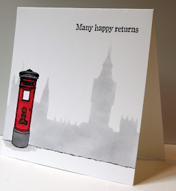
I made this card by stamping the pillar box (sorry, I've had the stamp since the dark ages and can't remember where it came from) and masking it off, then using the waste from a die cut of the London skyline (left over from this card which I made using Docrafts Create a Scene Dies) I sponged the buildings in the background to give the appearance of them looming out of the fog. I used grey rather than black for colouring the pillar box, so as not to obscure the detail, although looking at it now I think I should have done the very top in red - isn't it funny how we can have a clear mental picture of something we see every day, yet not be able to recall the exact details? (I'm sure it's not just me - go on, see if you can remember what colour your best friend's eyes are!)
Anyway, we don't get all that much fog in London these days, but when we DO, it looks something like this!
I am also sharing this at Mod Squad - Fast and Easy


Great Lim card xx Jan
ReplyDeletei was just thinking those foggy days are pretty much done and dusted ;-) Love the card , the mail column really pops against the background and it's pretty obvious which city it is, so kudos
ReplyDeleteLove your card - the background made me think of a Turner painting!
ReplyDeleteFabulous background and beautiful LIM card!
ReplyDeleteAnnie
A very clever design for a one layer, masculine card. The post box really stands out against the foggy skyline. xx
ReplyDeleteThe background is fantastic for your focal image.
ReplyDeleteThis is a brilliant take on the theme
ReplyDeleteKathyk
Super card Jane! Thank goodness we don't get the fog like we used to!
ReplyDeleteA terrific card. Great background, so wonderfully foggy. The pillar box really pops against the grey
ReplyDeleteLovely background and what a wonderful design.
ReplyDeleteHugs diane
Fantastic masking, that pillar box really does stand proud. Fabulous use of the great for your skyline.
ReplyDeleteThanks for sharing with us.
Anita x
Less is More
I apologise for my lack of comments over the past couple of weeks, but I'm now back from my cruise and ready for visiting once more!
ReplyDeleteThis is fabulous, the post box looks great against the foggy background!
Thanks so much
Chrissie
"Less is More"
Fabulous masking Jane and I'm so thrilled you found time to enter the challenge this week!
ReplyDeleteYou've certainly rocked it
Thanks so much for sharing and taking part.
Sarah xx
Less is More
That foggy background is perfect for your postbox Jane, this looks fab!
ReplyDeleteThank you for joining us for one layer week
Anne
Less is More
Love the classy look !
ReplyDeleteFabulous choice for this theme - love the letter box, and the sponged fog background is a perfect foil for the contrasting red!
ReplyDeleteFab card - love how you used the waste. Well you are truly putting me to shame now - using this die set twice!
ReplyDeleteLynn x
Adorable
ReplyDeleteI love your CAS design Jane
this is great grey background
looks contrast with the front image
I will remember your idea
Great card
hugs, Monika
Awesome card!!!
ReplyDelete