Pages

Saturday, 30 April 2016

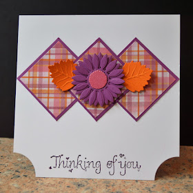
Check-mate

Here's a rather retro card I've made using lots of bits from my snippets box teamed with a stamped sentiment in a font style that is so very retro it really ought to have come back into fashion by now! It originally came from a US firm called Raindrops on Roses and is so old that I ordered it by post, which means it must be pre-1999 as anything I've bought from overseas since then has been done online.
 
The plaid paper is a remnant from a sheet of 12 x 12 from my trusty DCWV stack 9 - probably my most used collection of designer papers. The flower and leaves are cut with Spellbinders dies - I think they are all from the Jewel Flowers set.


I am sharing this with

Less is More - Use designer paper in a CAS style
Addicted to CAS - Plaid
Sparkles Monthly Challenge - Thinking of you

Happy Birthday Holly

Tomorrow, Mayday, is granddaughter Holly's fourth birthday. Since a family holiday in the Lake District last summer, which included a visit to the World of Beatrix Potter attraction in Windermere, she has been in love with Beatrix Potter's books. Her favourite is The Tale Of Peter Rabbit and she specially requested a Peter Rabbit themed birthday party this year, so I used images, decoupage and papers from Crafter's Companion's Beatrix Potter CD-ROM (the one I used is a sampler from Create & craft, I believe the full version has even more wonderful designs on it) to recreate some of her favourite moments from the book.


I am sharing this with C.R.A.F.T. Challenge - Inspired by a book  and Crafty Gals Corner - Anything Goes

Dreaming of a white-on-white Christmas

I find it very hard to give WOW cards a CAS twist (that's White On White and Clean And Simple for my non crafting friends!) but I really wanted to play with my new Memory Box "Happy Christmas" die, which is perfect for CAS designs, and to make a card for this week's WOW challenge at Winter Wonderland.


For the background, I used card from my stash, it is white with clear glossy striped embossed on the surface. The glittery band is simply a line of double sided tape, covered in white glitter.

I'm also sharing this as Crafty Hazelnut's Christmas Challenge - Anything goes.

Still not feeling well and not my chatty self, so this is a very brief post.

Wednesday, 27 April 2016

Missing in Action

I don't know whether you've noticed that I've not been around for a few days; probably not, since I had already scheduled posts for Monday and Tuesday. Last weekend we went for a short break in Kent, which Mark is writing about over the next few days over on his blog (sorry, being on the ipad right now I've not worked out how to insert a link into a post) but on Saturday I had a very nasty attack of hypothermia and have been very unwell since. Tests have shown that I also have an infection, which presumably is why I was so susceptible to the cold. For a few days now I haven't had the energy or clarity of mind to fire up the computer or pick up a knife, either the craft kind or the culinary kind. 

So I'm sharing with you a quick card I made a couple of weeks ago and never found a reason to post, and heading back to my pot of tea and pile of trashy novels. Many apologies for not visiting or commenting on any of your blogs or joining in any challenges this week. 


Tuesday, 26 April 2016

Wood in the design at Cardz 4 Guyz

Our latest challenge at Cardz 4 Guyz is to use some wood in the design.

I've chosen to use wood two ways, a printed wood effect background paper and real wood in the form of the keys and frame, all from the Curiosity Corner range. The wooden frame is actually covered in patterned paper on the other side, so I have used the reverse to show the bare wood, with just a whisper of distress ink to soften the raw edges. I cut the wood panel and border from a 12 x 12 paper in the set - it was too big for my card, so I trimmed the border off, cut the wood panel to size and then stuck the border over the edges. I added a metal brad and key and some buttons for extra texture and colour.


Monday, 25 April 2016

April's Rudolph Day

It's the 25th of the month again, and that means another Rudolph Day at Scrappymo's. It's one of my DT months off this month, but I've still made a card to remind you to pop over there and join in.


I used a square aperture card and covered the front with snowflake paper, then covered a slide mount with toning paper and added it over the aperture. The die cut on the inside is cut from a snippet of aqua card, and I positioned it through the aperture to make sure it lined up exactly. The sentiment is from an old magazine freebie set (it's dated 2012)

All the card and paper was from my snippets box, so when I get home from gallivanting around Kent I'll be popping over to Pixie's Snippets Playground to link up.

Friday, 22 April 2016

Cats on the rooftops

Every cat owner - or neighbour of a cat owner - will know how dreadful a serenading tom cat sounds, especially at 2am when you are trying to sleep. And if you shout at them to shut up - they simply don't care. So today's card is dedicated to everyone who has ever lost sleep thanks to an over-musical moggy.

The brick wall is embossed using a Crafters Companion folder, and the stars, image (yes, it's yet  another of those fab Katzelkraft kitties) and sentiment are heat embossed. A scrap of textured card forms the top of the wall. I'm sure there's a technical term for the stones along the top of the wall, but I've no idea what it is.


I've made this card for the latest challenge at the Sisterhood of Snarky Stampers, where Edna wants us to show some embossing. I've embossed my little socks off with this one.

A mystery folder

I was looking for an embossing folder the other day and came across this one - and I have absolutely no idea where it came from! I don't recall buying it,  and it's too sturdy for a magazine freebie, so I think it must have come as part of some candy or a goody bag. But why don't I remember it? Maybe the crafting fairies just tiptoed in during the night, and added it to my stash.

In any case, I thought I'd better have a play with it, so I combined it with some Spellbinders labels, a couple of butterflies die cut from a scrap of teal card - the butterfly is also a Spellbinders die - and a die cut sentiment, using a Tattered Lace die.


I am sharing this with:

Butterfly challenge - Texture and/or Teal
Dies R Us - Black and white with optional accent colour

Thursday, 21 April 2016

Happy Birthday Ma'am

It can't have escaped your notice, if you live in the UK, that today is Queen Elizabeth II's 90th birthday. In fact you've probably heard about it even if you live elsewhere.

However she isn't the only lady to be celebrating a 90th birthday this year. In a couple of weeks' time, my Mum will also be having her 90th birthday, and here is the card I made for her. I thought I would share it today because it is so relevant to the day.


The embossed background is a Crafters Companion die, and all the other dies are from Creative Expressions' Sue Wilson collection apart from the numbers, which are Spellbinders Victorian Numbers.

Wednesday, 20 April 2016

More Mackintosh

Earlier today, I posted my first make with the Charles Rennie Mackintosh stamp set from Creative Stamping magazine. Naturally once I'd started using these gorgeous stamps, I didn't stop at one card, and now I'm sharing my second card with you.


I'm sharing this one with Glitter 'n' Sparkle challenge - Red and White

Glasgow Rose Butterfly

The other day I got the latest issue of Creative Stamping magazine which comes with a whole A4 sized sheet of stamps in the style of Charles Rennie Mackintosh's  famous "Glasgow Rose" design. I love the stamps and I think you'll be seeing a LOT of makes using them appear on here over coming weeks and months.

Here is my first make, a butterfly stamped on acetate. coloured and glittered from the back and then mounted in the window of a tri-fold aperture card which itself has been stamped with images from the set.


Ooops! Now I've added the photo, I can see that the bottom right hand stamping is much too far over to the edge - one to earmark for next year's April 1st boo-boo challenge perhaps?

I am sharing this with:

Addicted to Stamps and More - Photo inspiration (the butterfly and colours)


Creative with stamps - Butterfly


Fab 'n' Funky - Winged Things

Make My Monday - Butterflies

Stampin' Royalty - Butterflies 

Tuesday, 19 April 2016

Cuddly Robins

In my experience, robins aren't terribly cuddly, they are very solitary birds and very possessive of their territory. We have a "garden robin" and woe betide any other robin that dares to stray onto his patch - except at mating season, of course! So OK, we'll pretend that Christmas is mating season (hence the mistletoe sprig!)  and get on with the card.....


I made this using a 3-D decoupage sheet printed out from a CD that came with a craft magazine a couple of Christmases ago - I printed it as soon as I got the magazine so now I can't recall which magazine or CD it was. The scalloped borders are actually the waste from when I die cut the waves for my Jonah and the Whale card. with a spot of blue Liquid pearls added to each scallop. I'm continuing with my one-woman campaign to revive peel-offs, at least until those of us with a huge stash of them have had chance to clear the backlog, although I do wish the "Seasons Greetings" sentiment didn't look as if it said Seazonz Greetingz!

I am sharing this with

Winter Wonderland - Pink or Blue 
Crafty Hazelnut's Christmas Challenge - Cute

Books or Book Paper at Cardz 4 Guyz

It's time for our new challenge at Cardz 4 Guyz, and this week we would like to see Books or Book Paper in your design.

I must admit I struggled with this at first. Although I love to see altered and folded books, I can't bear to do that myself; I don't like to write in books, or turn the page corners down, or do anything to hurt them. In fact when I thought about making an altered book, it made me want to rush to my books, all 5 bookcases full of them, and fling my arms around them to protect them!

Luckily my Dovecraft Curiosity Corner collection of goodies contains some newsprint paper and paper with newsprint leaves on it. so although it's technically imitation newspaper rather than books, I am claiming artistic license!

I fussy cut the leaves from two different sizes of paper, leaving a border around them so they would stand out from the background. My choice of image is determined by the fact that I wanted to use this gorgeous vintage bicycle ribbon I won in a recent challenge - isn't it super? The image itself is a die cut from an old Hunkydory kit.


I am sharing this with:

Suzy Bee's Blooming Challenge - Make it Male
A Bit More Time to Craft - Anything Goes
Craft Your Passion - Anything Goes
Crafty Hazelnut's Patterned Paper Challenge - April    

Monday, 18 April 2016

Vintage Tulip

One of my oldest and most favourite stamps is the Hero Arts vintage tulip stamp. Oddly enough it is also my six year old granddaughter's favourite, and she would much rather use it than the fun children's designs I have stocked up with for her.


Today I've combined it with a script stamp, it's an old unmounted red rubber one so I must have got it in a grab bag at some point. The script is hard to read but it's all about the language of flowers, so ideal to use with a floral image.

I stamped the script to fill the background, using Versmark ink, and then dabbed several shades of green chalk over it and inked the edges. The tulip is coloured in with Promarkers and has made me realise I need to get some more, less harsh, shades of green!

I'm sharing this with House of Cards, where the April challenge is a colour challenge and/or script.  I've nailed the script side of it, but my poor selection of greens means the colour challenge part is a bit off-message. And it's only now, while copying the inspiration photo to paste here, that I've realised I've subconsciously copied the image on the photo - that wasn't intentional! But it just shows what a lovely picture it is and how it stuck in my mind.

Happy Birthday CD Sundays!


Today is the 6th birthday of the blog The CD Sundays Challenge, where every make needs to include something from a craft CD.

I've not been playing for the whole 6 years - this blog has only just turned 4, and it took me a while to pluck up courage to start joining in challenges. In fact I was a "lurker" at CD Sundays for some time before joining in, because although I owned a few craft CDs I was never really sure what to do with them, I couldn't imagine anything beyond printing a background paper and topper and setting one on top of the other.

However by looking at the DT inspiration and entries to the challenge, I soon realised what valuable and versatile crafting tools CDs could be, and thanks to what I have learned through the challenge,  since joining it I've been privileged to spend a year on the La Pashe design team and 3 months as Guest Designer at CD Sundays itself. And my ever-growing store of CDs now gets regularly used, and not just for entering this particular challenge.

For the birthday celebrations, we have been asked to backlink to our favourite of all the cards we have made for the challenge. I spent most of yesterday re-reading my old blog posts, and ended up with a shortlist of a dozen posts, but one of them stood out as by far my favourite (and not just because I was awarded a top 3spot for it!)


You can find the original post here.

Why is it my favourite? Well, partly because I tend to struggle a lot with making anything pretty, but to me this is one of the prettiest things I've ever made, but mostly because it - and the whole post - reminds me of an amazing workshop I did with Debbie Moore at the Make It Show in Farnborough, where she showed us how to make all kinds of beautiful fancy fold cards with no measuring or calculations. It was a real inspiration and whenever I'm running out of ideas for making cards more interesting, I refer back to this post and it reminds me not only of the folds I used in it but of all the others she showed us.

A very happy birthday to CD Sundays and I hope there will be many more of them!

Sunday, 17 April 2016

Christmas pine cone


I used a pre-cut aperture card for this card, then realised once I'd covered the front with paper I was going to have to cut the aperture all over again so I might as well have started out with a plain card..... doh!

The conifer sprig is stamped on a circle of white card slightly larger than the aperture and positioned after making the card front, to make sure everything matches. And I resurrected a few peel offs to decorate it because I am predicting that this year will see a big peel-off revival. I've been seeing some great new ideas in the peel off ranges, and that is bound to rekindle interest in the more traditional designs. You heard it here first!

I am sharing this with 52 Christmas Card Throwdown where the theme is Christmas Foliage  and Uniko Studio where it is Metallics

It ain't necessarily so.....

Let me set the scene. Whenever anybody is particularly unlucky, Mark refers to them as a "Jonah". Well, I suppose getting swallowed by a whale is a particularly unlucky thing to happen to somebody, isn't it.

And when I printed out this glum-looking Grumps image from the  CD The Best of La Pashe 2014 I immediately thought he looked like a proper Jonah.  At the time, the rain was torrential and it was easy (well, easy for MY imagination) to imagine our rivers getting so swollen that an unsuspecting river angler might find himself swallowed up by a whale that had swum off course.

So I raided my snippets box for all kinds of blued and greys and die cut some waves and a whale, using dies from the X-cut Build a Scene Pirate Ship set that I won a while back in the Playground. I livened up the die cuts a bit by sponging on inks in greys, blues and white. I finished the image with Wink of Stella which as usual you can't see, to make the rain glisten.


I am sharing this with

Cuttlebugmania - Rain
Suzy Bee's Blooming Challenge - Make it Male
Pixie's Snippets Playground - week 225 (all the layering and die cutting was done with snippets)

Oh, and the title? It comes from the way my brain tends to play "musical word association"  - every time I see the world "whale" I start to hum the bit about Jonah living in a whale, from the song "It ain't necessarily so"  from Gershwin's Porgy and Bess.

Saturday, 16 April 2016

Take the Train


For this card I have used an image, word panels and ephemera all cut from a sheet printed out from Debbie Moore's CD "Shabby Chic- Vintage Discovery". The backing paper is a sort of tweed print that I found in my stash, and unusually for me, I have absolutely NO idea where it came from or how long I have had it! The cogs are cut from a piece of card that was part of the QVC "Elegant Vintage" kit many, many years ago. I cut everything out and then played around with it, collage style, until I had an arrangement I was happy with.

I am sharing this with

Ooh La La Creations - Words, Words, Words
Suzy Bee's Blooming Challenge - Make it Male

Body Parts at Twofers

Yes, you read that right - body parts! It's our latest theme at Twofers  - and we don't mean just human body parts, you could use part of an animal or vehicle body in your work.

I've chosen to do an elephant's bottom! I'm not sure how or why I have a stamp of an elephant's bottom, but here it is, complete with a tiny bird (an egret? I've only seen them on water buffalo but it looks like one) hitching a ride on his back.

I stamped, coloured and fussy cut the elephant, then my original plan was to make a watercoloured savannah scene and have him heading off into the sunset, but I was having a "nothing works" day and abandoned the watercolour in favour of a far more CAS design. Now he is heading off into a very stylised sunset created by inking the Gentleman Crafter's brushed circle stamp with yellow ink and then dabbing an orange inkpad around the edges of the stamp. The sentiment is one row of a stamped sentiment from a Dylusions set.


Let's see what ideas for body pars YOU come up with - pop over to Twofers to share them with us, remember that as usual we want  to see some stamping and no digis.

I am sharing this with
Craft Your Passion - Anything Goes
A Bit More Time To Craft - Anything Goes
Less is More - Use three stamps (elephant, brushed circle and sentiment)

Friday, 15 April 2016

Chloe again

One of my all-time favourite dies is the Memory Box Chloe Stem die, and I know from many of your comments that I'm not alone in that.


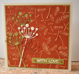
Today I've combined it with my favourite colours of cream, terracotta and light olive to give a card with an autumnal feel. I cut it from the terracotta card fist, then embossed the remaining card with a Crafters Companion embossing folder and sanded the surface lightly. before matting onto the olive card, I cut the olive Chloe stem, lining it up carefully to make sure the gap wouldn't show around the edge or within the die cut negative. The cream Chloe stem is cut from the remainder of the sheet of cream card I used to  make the card blank. The sentiment is a Tattered Lace die and I was lucky enough to find two terracotta coloured heart gems in my stash.

I am sharing this with:

Mod Squad - Make  a Negative a Positive
Crafty Gals Corner - Die Cuts or Punches
Craft Rocket - Favourite Colour Combo
Cardz 4 Galz - Use an Embossing Folder  

Rainbow City

 
Part of my decluttering, which is still ongoing, is to go through my pile of old craft magazines and see if I kept them because of any projects, layouts or colour schemes that I wanted to try, then actually TRY them before discarding the magazine. In one of them I found a project that used Tim Holtz's Cityscapes stamps, randomly inked with distress inks, spritzed with water and then stamped on watercolour paper. I didn't try it at the time, as I had no watercolour paper, but I've refreshed my supply now so gave it a go - here is the result. So far I've only used the Cityscapes stamps with black ink - the multi-coloured ones give the image a whole new, vibrant character.

I'm sharing this with C.R.A.F.T. Challenge - Clean and Simple

When I'd made the card, I thought what a great rainbow effect the random colours had made, and that made me think about the Over the Rainbow challenge at Naughty or Nice - could I stamp the image in "proper" rainbow colours, in the right order, and drop in for another entry into the challenge? Well, I didn't have any violet DI, and when I tried blending to get it, I got a pretty good indigo, so to make up for the lack of violet ink, I made a background for my stamping by die cutting a London skyline scene from violet card. So here we have it, London, the Rainbow City. I have lots of gay friends living in London and I'm sure they'd agree (especially as I don't have a San Francisco stamp!).


Reindeer trio

 
This card is made using a trio of reindeer stamps from Lili of the Valley, coloured with Promarkers. The base card is smaller than a DL card, it came from a QVC set I bought years ago that had a few unusual sized cards in it that I never really found a use for. I kept the card very bold and simple so as not to detract from the fun images.
 
I'm sharing at Sweet Stampin Christmas - Animals.

Thursday, 14 April 2016

Stamping with....... A PARSNIP!!!! (with apologies to Di)

Oh dear, Di from Pixie's Crafty Workshop is never going to forgive me for this! But I really don't mean I've been stamping with a small white bear, I really DO mean the delicious root vegetable.

It all started last night when I was preparing some parsnips to roast for dinner. I remembered how I used to show people how to make carrot butterflies to decorate stir fries with, in the days when I used to give evening classes in Oriental cookery, and I wondered if I could carve a parsnip the same way.

Then I stated to peel the potatoes and thought about childhood days of potato printing and my brain made the link - what if I were to carve a parsnip and print/stamp with it?

So, I kept the parsnip tops, left them overnight to dry out, and dug out the old lino-cutting tools I used to use for carving carrots with.


I kept two tops, in case I messed one up (which turned out to be a wise move).

To carve a butterfly, first cut it so there s one long edge and one shorter one, and cut diagonal lines between the two


Then use your lino tool or a sharp knife to cut V-shapes either side of the centre, top and bottom, and halfway up each side for the wings. I also distressed the edges a little with a knife.


And now you are ready to print! The core of the parsnip recedes slightly, giving an interesting "starburst" effect in the middle. I used a very juicy pink Versacolor pad to stamp with, setting the stamping with a heat gun when it was finished.


Then I cropped the stamped area to fit a card blank and added a ribbon that has been in my stash for many, many years - it was part of the very first Hot Off The Press kit I bought from QVC so it was while my daughter, now almost 37, was at 6th form college (I know because she was doing a project about TV shopping in her media studies class, that's how I started to watch QVC!). It's ribbon with a very odd scrunchy but soft, distressed feel to it, which gives it a rather distressed look, perfect with these "distressed butterflies" and exactly the same salmon pink colour. All it needed to complete the card was a tag and a peel-off greeting.


And that, my friends, is how you stamp with a parsnip. Di please note, no small furry animals were harmed in the making of this card!

I'm sharing this with

Shopping our Stash - You stamped with WHAT???
CASology - Pink

Playing with my Gorjuss papers


This week's challenge at Fab 'n' Funky is Girly and Pretty. Well, as you know, I'm not really a girly and pretty type, except for the occasional foray into shabby chic, but I think these Gorjuss designs are definitely girly, and have a kind of dark prettiness about them. I'm not 100% happy with the die cut decoupage, I'm more used to doing it by hand; I think next time I will sponge a little ink around the edge to hide the white lines.  I mounted the little fox above a punched black circle of exactly the same size, so that you can only see the black when looking at it at a slight angle, just to add a bit of interest to the card.

Wednesday, 13 April 2016

Dog Daze

When I read that this week's Make My Monday theme was Pets, as always my mind leapt straight to cats. However I do seem to have made a LOT of cat themed cards recently, and I had this lovely doggy ribbon just begging (do you see what I did there? Begging.... dogs... oh, never mind) to be used. And  so was this lovely stamp from Little Claire's, which must be my most favourite doggy stamp ever. So dogs it is, then.

I found this lovely stripey paper in my stash, I think it came from Craftwork cards. It probably doesn't show on the photo but it has a very slightly pearlescent sheen on it, a great contrast to the heavy matte finish of the kraft card I was planning to use for matting, and used Promarkers to colour the dogs in to complement the paper and card.


Since I used lots of kraft card on this. I am also sharing with Use Your Stuff, where the current challenge is Kraft.
And I think this is my first ever visit to House of Stamps, where the theme is Who let The Dogs Out?

Not too sure about this one!

I'm going to apologise in advance for this card - I made it for the Glitter'n'Sparkle blog's Sun/Moon/Stars/Space challenge, but the idea in my head and the finished card really don't match up with each other and I'm very disappointed with it. Where's Darnell's Boo-Boo challenge when you need it? I'm sharing it anyway, just to show how much can go wrong with one little card.


For a start, the base card I used was one of two I have left from a pack of hologram cards I bought many, many years ago. It's been lurking in my stash for all that time, and really, if I'd liked it, I'm sure I would have used it long before now. Sometimes there are stash items we really ought to admit have defeated us!

Next the moon and stars image, which is a very old unmounted stamp. My idea was to stamp it with a blue water based ink, then use a waterbrush to draw out some of the blue to form a background. So far so good. But I wanted the moon and stars to shine to go with the hologram card, so I coloured them in with metallic gel pens, and they simply don't give a good enough coverage over large spaces. I tried going over it again, but I could feel the card beginning to give way under the pressure of the pen. But heigh-ho, the real moon isn't evenly coloured, is it?  It's riddled with craters, well, so is my image after all that colouring!

Now on to the sentiment. When I was a little girl, my grandma always used to say that if you saw the new moon, you should turn your money over and make a wish. So this Craftwork Cards "Make a wish" diecut sentiment was the obvious choice. The trouble is, with everything else matted and layered, it looked a bit lost just plonked on the card, yet I don't have any dies that fit it, so had to hand cut the layering. You have NO IDEA how many times I recut that blinkin' cardstock! And it's still not even.

I added some peel off stars to the bottom corner, but I'd used up all the ones I wanted to use and these are far too small. And finally, take it from me, trying to photograph such a large area of holographic card is a complete and utter bu$$er. Can you see that blueish cast towards the bottom of the card? I think that's a reflection of the air around me as I spewed out a collection of unladylike words.

Oh well, at least I tried, and you Glitter'n'Sparkle ladies are going to have to take a look at it if only yo laugh at all my failures!

Keeping Christmas CAS and Classy

I think clean and simple Christmas cards can look very classy, especially when using a very restricted colour palette - and what could be more restricted than simply white and gold?

For this card both the image and the sentiment were magazine freebies from some time ago, embossed with gold ink and powder.


I am sharing this with

Addicted to Stamps and More - Clean and Simple
52 Christmas Card Throwdown - White and Metallic Gold


Tuesday, 12 April 2016

Food and Drink at Cardz 4 Guyz

This week it's my turn to choose the challenge at Cardz 4 Guyz, and since you know how much I love eating and drinking, you won't be surprised to learn that I have chosen Food and Drink as the theme.

Here is my card for the challenge:


The stamp set I have used is from Honey Doo Crafts - it is called "A bottle of vine" <groan>  and I think it is all set to become one of my favourite sets. The wine glass is stamped onto heat-embossable acetate - normal acetate will shrivel and melt if you try to heat emboss it.

We'd love to see what food and drink themed cards you can come up with it - remembering, of course, that they need to be suitable for a male recipient.

Monday, 11 April 2016

Butterfly and Bronze


For this card I used a very old cardboard stencil and sponged Versamark ink through onto my card blank. Then with the stencil still in place, I used a cottonwool ball to press mica pearl powders in gold and copper through the stencil. After removing the stencil, I spritzed lightly with water to set the mica powders and give a slightly misty background to the squares.

When it was all dry I stamped the butterfly - an Indigo Blu stamp - and the sentiment - an ancient unmounted one whose origins I can't remember - and coloured them in with water based markers so as not to show through on the inside.

I am sharing this with

One Layer Simplicity - As you wish
Less is More - Geometric Shapes or Patterns
CAS Mix up - Stamping, stencilling and your choice  -mica pearl powders
AAA Cards - Anything Goes 


Rainbow Sprinkles

I love this sentiment, from one of the Dylusions sentiment sets, it's a real celebration of unique-ness. And perfect for the current challenge at Naughty or Nice Challenges, Over the Rainbow.


I've used a plain vanilla card base, of course, and then used the small stipple stamp from Gentleman Crafter's texture sheet to stamp random splodges of rainbow colours over a strip of white card. Each side of that, I put a strip of narrow double sided tape and applied rainbow foil from Foilplay The foil has reflected the light too much in the photo, as always with shiny or pearly things it looks much better in real life.

Pretty Prehistoric

The latest word prompt at Inkspirational challenges is ROCK.


That immediately made me think of the Clearly Besotted "You Rock" stamps, so I used them to create this little dinosaur landscape on a die cut circle, finishing the card with words from the set and from a Studio G mini set. I coloured the scene with Promarkers....... whaddya mean, dinosaurs weren't purple? We've only got their bones to go by, so we don't know what colour they were. In fact maybe they WERE brightly coloured, and that meant they couldn't hide from bigger, hungrier dinosaurs. And perhaps that's why they died out - the little ones were so easy to spot that the big ones ate them all, and then when there was nothing left for them to eat, they died of starvation.

Well, it's a theory......


I am also sharing this with Suzy Bee's Blooming Challenge where this week's twist is Clean and Simple.

Sunday, 10 April 2016

Scalloped sympathy

I don't like to make sympathy cards, because of  the occasion they imply, but it's always as well to have one to hand, or a few ideas for making very quick ones, as they are usually the kind of things one can't plan ahead for. I keep my sympathy cards CAS and stick to colours of purples, black and sometimes grey, with a theme of flowers and/or butterflies.

This card uses an old Penny Black stamp called Quite Dandy (although those can't be dandelion clocks, the leaves are all wrong) and a butterfly from an Indigo Blu set that was a magazine freebie. I stamped it all with purple ink and used a scalloped square Nestabilities die to die cut a mat for it. The sentiment is a La Pashe "easy-peely" one.


I am sharing this with

Allsorts Challenge - Purple Passion
Dies R Us - Use Scallops
Just Add Ink - Just add Sympathy
Creative With Stamps - Butterfly