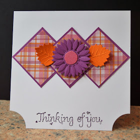
Here's a rather retro card I've made using lots of bits from my snippets box teamed with a stamped sentiment in a font style that is so very retro it really ought to have come back into fashion by now! It originally came from a US firm called Raindrops on Roses and is so old that I ordered it by post, which means it must be pre-1999 as anything I've bought from overseas since then has been done online.
The plaid paper is a remnant from a sheet of 12 x 12 from my trusty DCWV stack 9 - probably my most used collection of designer papers. The flower and leaves are cut with Spellbinders dies - I think they are all from the Jewel Flowers set.
I am sharing this with
Less is More - Use designer paper in a CAS style
Addicted to CAS - Plaid
Sparkles Monthly Challenge - Thinking of you


Pretty card Jane. Hope you're feeling better now!
ReplyDeleteSuper CAS card using Designer Papers too
ReplyDeleteKathyk
Love it Jane. What fantastic colours. When we had our wide borders in the garden I loved orange and purple flowers together. It's a shame you've finished up that lovely paper. Barbxx
ReplyDeleteIt might be retro, but it's still cool! Cara x
ReplyDeleteLove your colour combo and design - a great card - retro is definitely 'in':)
ReplyDeleteFabulous designer paper and colour selection! This is so retro and so impactful with a great use of shape for visual appeal. Nicely done!
ReplyDeleteSuch a pretty CAS design! Great use of plaid paper. Thank you for playing along with Addicted to CAS!
ReplyDeleteLove your bold colours and design !
ReplyDeleteGorgeous card love the design, thank you for sharing this with us at Sparkle Monthly..hope to see you next time.
ReplyDeleteHugs Babs DT member x
Lovely colour combi Jane - and the plaid looks super behind your bloom
ReplyDeleteThanks so much for joining us
Anne
"Less is More"
Super use of designer paper here Jane. Love the vibrant colours and especially like the way you have the plaid on the inside of the card so that it shows on those cut-away corners.
ReplyDeleteThank you so much for sharing this with.
Sharon xx
"Less is More"
This is really super Jane, the colours of the paper are perfectly matched with your card!
ReplyDeleteThanks so much
Chrissie
"Less is More"
Great card love the plaid paper and those colors. Thanks for joining us at ATCAS.
ReplyDeleteLovely! Thank you for sharing with us at Sparkles Monthly Challenge.
ReplyDeletefabulous card. loved the chopped corners. Thanks for sharing your card at ATCAS!!
ReplyDelete