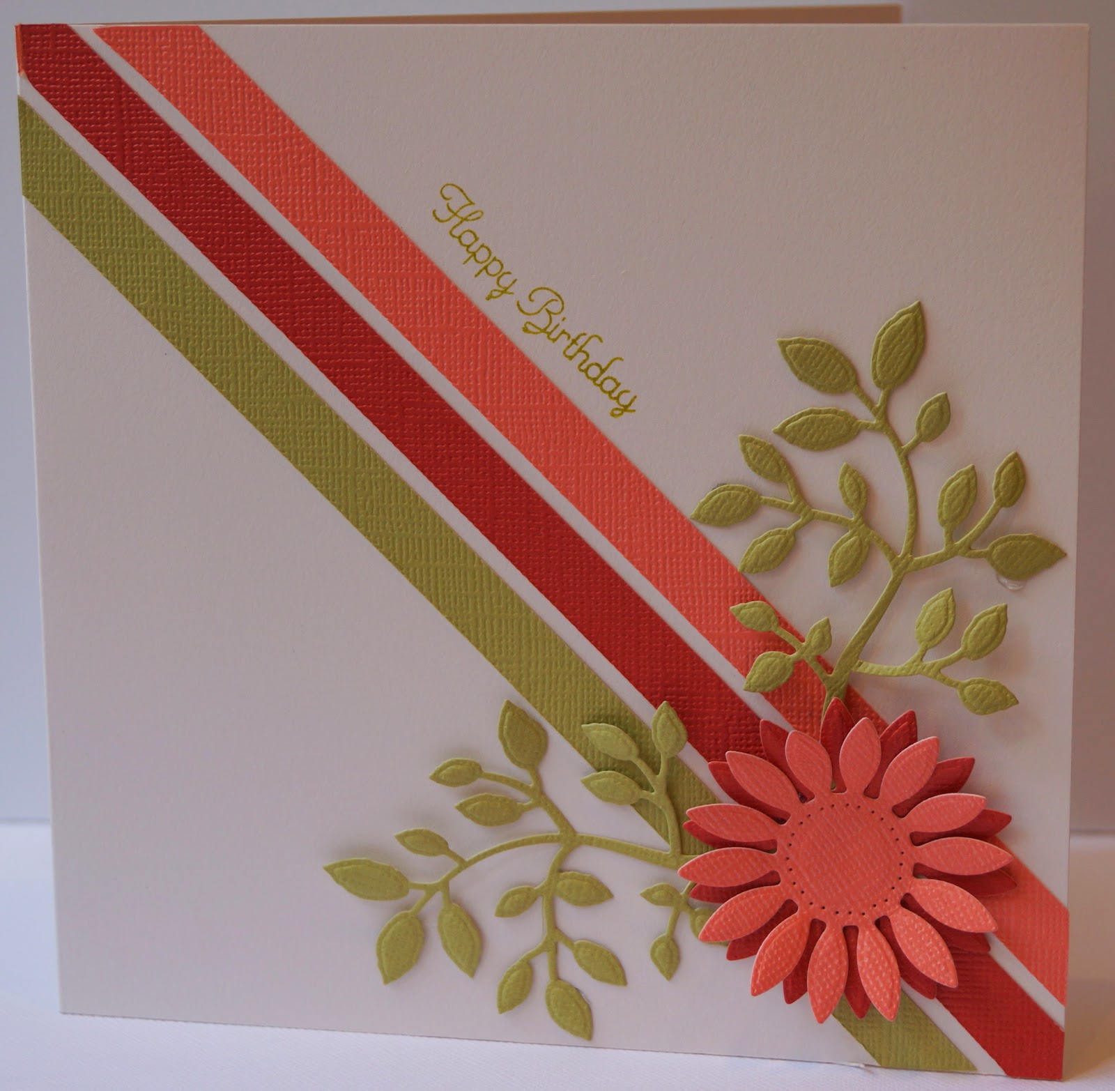
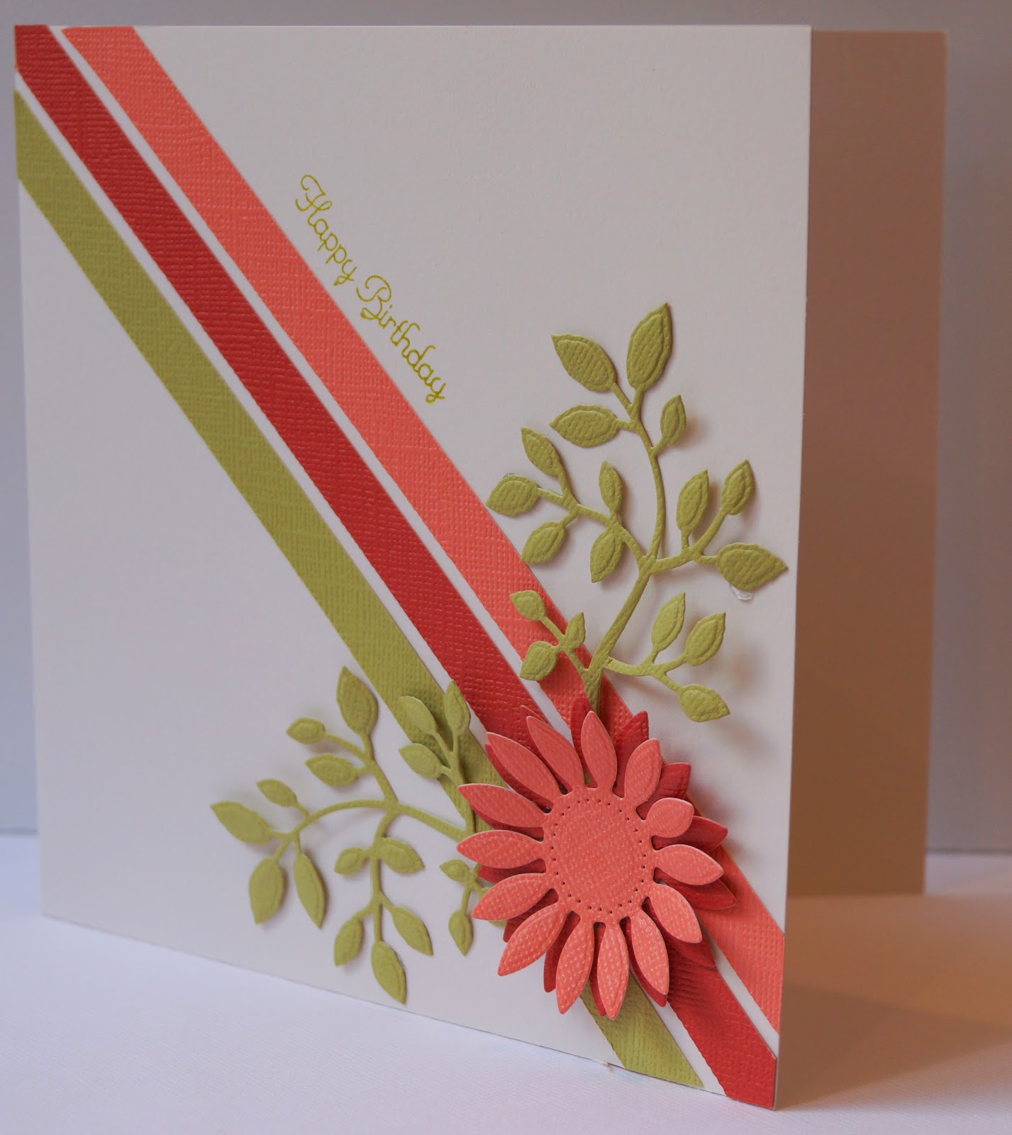
This week's challenge at Less is More is to use the colours in your bedroom. My bedroom is decorated in warm shades of terracotta, from delicate pinky tones to the reddish shade that resembles ancient brick, with light olive green highlights and cream neutrals. Rather a lot to cram into a CAS card, but I've picked just three of the shades and used them on a cream card.


7 comments:
Beautiful colours Jane and thanks for letting us take a peek.
Love your layout and floral detail.
Thanks for join in at Less is More
Sarah (LIM)
Jane all good stuff but what is happening with the Sony Camera! I am agog with expectation, Mark is producing some great pictures you can`t let him get away with it you know he will be unbearable, all the best hope mum is on the mend, David
This looks simply gorgeous Jane!
Thanks so much
Chrissie
"Less is More"
Gorgeous card. Love the colors and the beautiful bloom.
Wow Jane I love your design. And these colors are scrumptious. So happy you joined us over at Less Is More this week. -Lisa Lara (LIM Guest Designer)
Super stylish card Jane!
Thank for for joining us at Less is More this week
Anne
LIM Designer
I love the colours used, those leaves are fab. Helen T (LiM No. 70)
Post a Comment